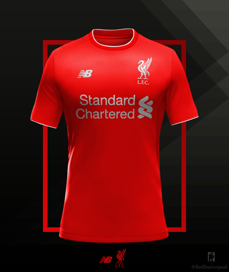
So, the new Liverpool home shirt has been launched. After months of leaks and fakes being circulated across social media, we now know what the Reds will be playing in for their first home game of next season. Some fans will no doubt love the new design, and even more will part with hard-earned cash to get their hands on it. But, in this fan’s opinion, and as someone who spends most of their free time making pretend football shirts, New Balance could have done so, so much better.
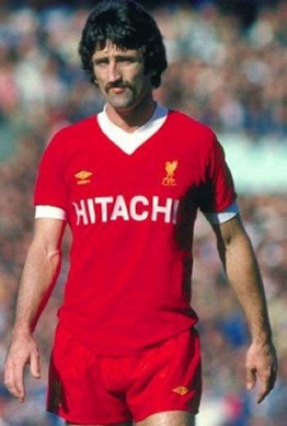
Football shirt designers are presented with a quandary; they must take in to account decades of tradition and often very iconic strips, while pushing the boundaries and breaking new ground. Liverpool have never been reluctant to take stylistic risks when it comes to what to wear (Who could forget the Spice Boys and their sparkling white suits?). The Reds’ first major style decision was famously made by none other than Bill Shankly himself, almost exactly fifty years ago, when he chose to send his team out in a fully red kit for the first time. A decade or so later, Liverpool’s Hitachi-sponsored shirts became the first to carry a sponsor in the history of the Football League. In more recent times, the club’s kit manufacturers have taken some less successful risks, including a lot of really dodgy away kits.
Such is the quality of LFC’s back catalogue that it’s easy to spark an endless debate with fellow fans on what the best and worst Liverpool shirts are (I should know, I’ve done it on Twitter countless times). So the following choices are my own favourite Liverpool home shirts; the tastes of a football shirt nerd and someone who spends far too much of their life making pretend football kits instead of talking to actual humans.
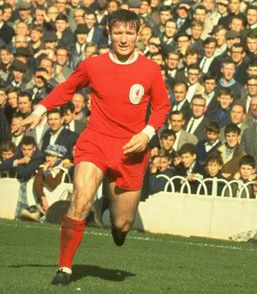
The kit that started it all; the first red shirt to be worn with matching red shorts. The key here is the simplicity, as with all the best shirts of this era of football, but it’s the white collar and cuffs that really make this red shirt as striking and memorable as it is.
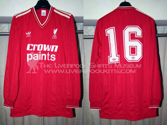
Here’s a lesson in how to fit a lot of features on a Liverpool shirt, without taking away from the kit’s overall look and feel. The Adidas stripes are present, but kept to a subtle minimum, while the underlying watermark is faint enough so that the shirt remains an unbroken red when viewed from a distance. Importantly, this kit features the simple Liverbird logo that LFC have brought back so effectively, rather than the later shield-style badge.
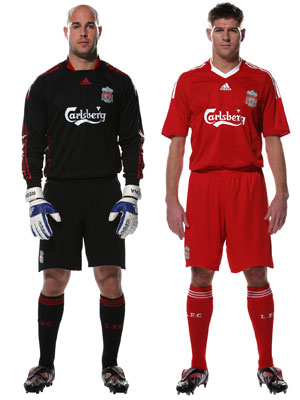
The reality of modern football shirts is that manufacturers have to keep introducing new ideas, trends and features to guarantee shirt sales every season. Amongst this, club identity can be thrown to the wayside in favour of too much innovation. But this Liverpool kit was the exception; a classic update to the traditional red-with-white trim look, managing to be innovative while sticking with Anfield tradition.
This is my favourite ever Liverpool kit. The V neck is the big feature, and it works perfectly, providing the counterpoint to the gold logos which make this shirt so classy. On top of that, the sponsor’s logo is used perfectly. The simple Hitachi emblem makes an instant impression without detracting from the clean red of the rest of the shirt.
As a fan, looking back through your team’s old kits brings back floods of nostalgia. Moments of tension, pain and pure elation are conjured to life by a simple item of clothing. And perhaps that’s where the design of the shirt fades into insignificance. Liverpool’s 2005/06 home kit was nothing special, but it will forever be etched in our minds as the shirt we wore in Istanbul. I have no doubt the reason I like 2008’s kit so much is because of the fact we finished 2nd and had a fantastic season. Different fans will have different favourite moments and different favourite shirts as a result. In reality, Liverpool’s shirt manufacturers do not have a tough job – make it red, put a Liverbird on it, and you’re on to a winner. Mess around too much with patterns and trim, like New Balance have for the latest shirt, and you’ll have the fans in uproar in no time.
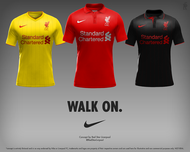
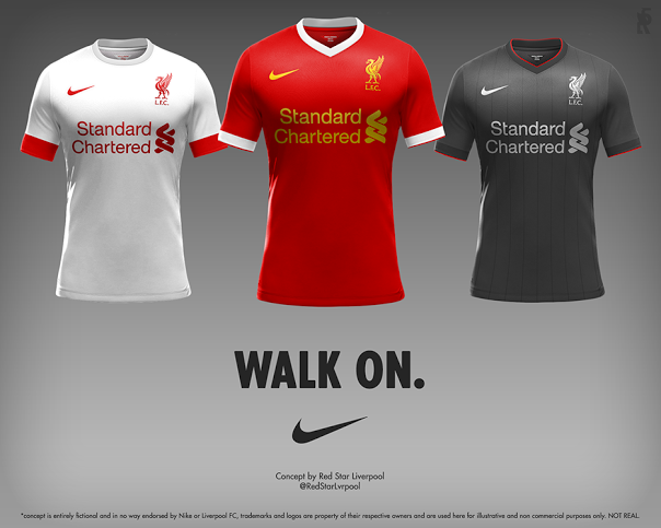
Here are the concepts I designed for an imaginary partnership between Liverpool FC and Nike (We wish).
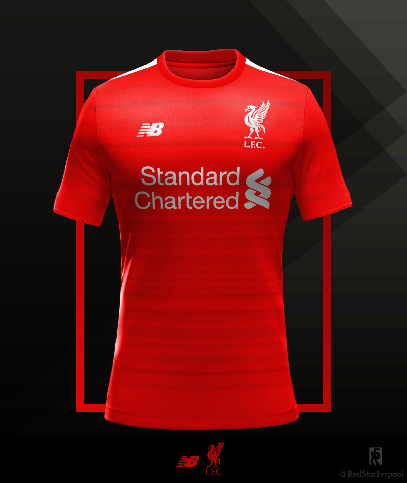
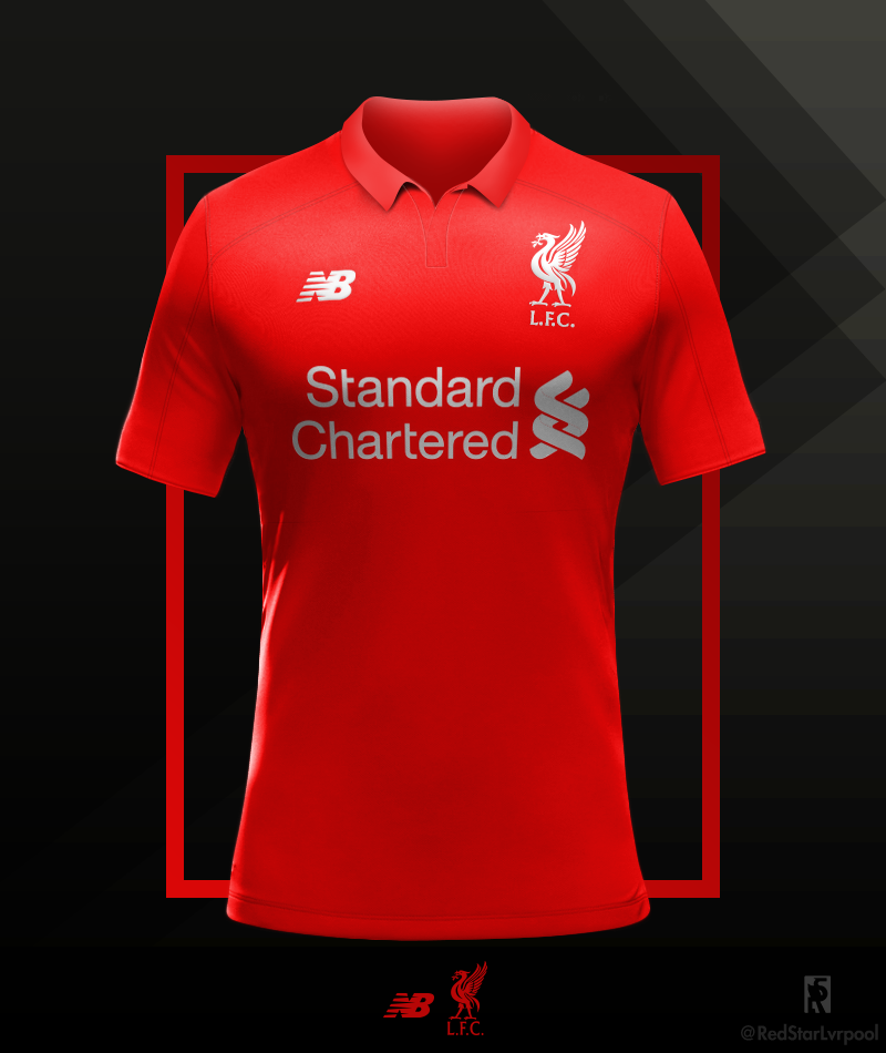
Here’s another couple of Shirt Designs for next season, this is what I felt New Balance should have done.

